Style Guide
Logo
The logo is available in 3 formats:
Use the logo version best suited to the available space.
Minimum clear space around the logo:
25% of the total logo width.
Minimum size:
Stacked:
18 pixels wide/0.25 inch wide/0.635 centimeter wide.
Horizontal:
18 pixels wide/0.25 inch wide/0.635 centimeter wide.
Stacked

Horizontal


Display the logo and/or icon in any colour that strongly contrasts with the background colour.
Icon
The icon is designed for use as a Favicon, social media icon or watermark.
Use the icon when the logo is to appear in perfectly square or round space of limited size (e.g. Twitter, Browser Tab, etc).
Don’t:
- Alter the logo elements in any way
- Apply effects or patterns to the logo
- Stretch or alter the proportions of the logo
Logo usage

Display the logo and/or icon in any colour that strongly contrasts with the background colour.
Minimum size:
Stacked:
18 pixels wide/0.25 inch wide/0.635 centimeter wide.
Horizontal:
18 pixels wide/0.25 inch wide/0.635 centimeter wide.
Minimum clear space around the logo:
25% of the total logo width.
Branch logos


Partnership logos
Typography
Typography expresses hierarchy and brand presence.
Font Syles
Usage Example
h1 Pizza Recipe
h2 Ingredients
h3 Ingredients for the base
Body Copy
- 4 ½ cups flour
- a pinch fine sea salt
- 1 packet instant yeast
- ½ T caster sugar
- 2 T extra virgin olive oil
- 375 ml warm water
h3 Ingredients for the toppings
h2 Instructions
h3 Preperation
h3 Cooking
Accent Colours
Accent Colors change the default style for Links, Button backgrounds, Tab and Accordion headings, and Badges.
Theme colours
Primary
#BD2C26
Secondary
#4C4C4C
Extended palette
#191919
#4c4c4c
#7f7f7f
#cccccc
#333333
#666666
#b2b2b2
#e5e5e5
Accordions
Tabs
Links
Buttons
Icons
Icons are useful because images can communicate an idea faster than text, they give context to your message and they can help overcome language barriers.
Consistency, as with everything, is key. When adding icons, avoid mixing and matching icons with very different styles or variations in line-thickness, and avoid mixing Line and Solid icons.
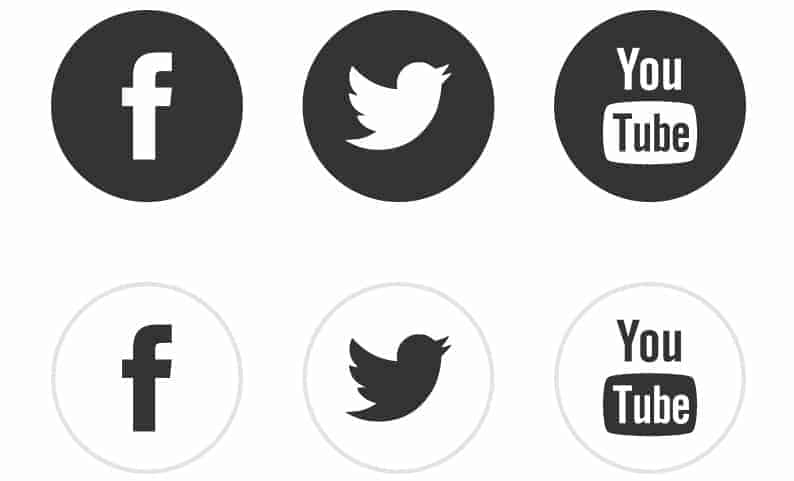
It is important that your icon matches your message. Don’t use an icon if it doesn’t enhance the message being communicated!
Line
Solid
Default
Stacked
Framed
De-clutter: Leave lots of white space – keep it practical and clean.
Label fields clearly: Keep the field close to it’s label to avoid any confusion.
Try to keep things optional: Name, Surname and email should be the only required fields.
Test responsiveness: Ensure it’s easy to complete on any device.
Go with the flow: The design should visually guide the users – from completing details to submission!
Partners
